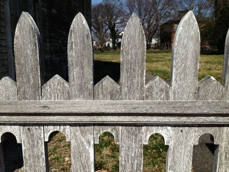
 Good fences make good neighbors and good "Design snapshot" subjects. This one is a great example of the power of negative space. But since I've never been a big fan of the term "negative space" (due to its negative connotations), let's think of this fence more in terms of figure and ground.
Here, the fence rail and posts act as the "figure" and the space shaped in between and around them act as the "ground". In this design, both figure and ground are engaged distinct shapes which create a lively border. The rough silver-grey cedar finish contrasts the crisp geometry of the figure and ground, which makes this fence all the more "Design snapshot" worthy. Sure, if it were painted, it would still be striking, but weathered grey, it's stunning.
by Katie Hutchison for House Enthusiast