


Entries in opinion (15)
How-To-Build-Community poster
Why is it that shortly after you a learn a new word, you bump into that new word everywhere -- in conversation, on the radio, on T.V.? Or say you discover a new actor, next you notice that actor hiding in plain sight on the cast of shows or movies you've watched a number of times. Well, I've recently been focused on community -- not just virtual community, but brick-and-mortar community -- and now I'm realizing many other folks are focused on all aspects of community, too. I suppose my heightened awareness of community is, in part, due to the fact that I'm living in a community that's new to me. Like a new word or newly recognized actor, notions of community have migrated from my subconscious to my conscious mind.
Yesterday, at my new-to-me local coffee shop, The Coffee Depot, I dashed off to the restroom before continuing on with my Saturday, and noticed an unusual poster affixed to the restroom wall. Not an all-employees-must-wash-their-hands kind of poster (though there may have been one of those), but a poster titled How To Build Community published by Syracuse Cultural Workers.
It lists forty-four simple actions you or anyone can take to build community.
Here's what it says:

It's common sense. It's wise. It's worth doing.
by Katie Hutchison for House Enthusiast
 Katie Hutchison
Unfurnished Possibilities
 We’ve just moved for the first time in eleven years. So we’ve spent the last month re-acquainting ourselves with the contents of our home. First: sorting, recycling, donating, shredding, selling, and packing. Then: unpacking, sorting, recycling, inheriting, purchasing, and placing. Granted, most find step two a lot more fun than step one. But a rigorous edit of your belongings in step one, can be nearly as satisfying. The real payoff is more room to breathe in your next home.
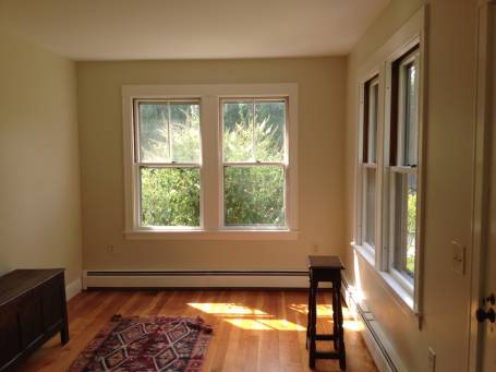
 To me, the space in the photo above, taken in our new place during the home inspection, is ripe with possibility. The few pieces of furniture in the shot belong to the previous owner. This southwest-facing corner is washed with daylight on sunny days. The challenge is to outfit it so as to maximize its intrinsic appeal – daylight from two directions through paired, generous, two-over-one lite, double-hung windows; warm hardwood floors; a relatively tall ceiling; a pleasing neutral paint palette, and well-crafted trim. To do such a space justice, while personalizing it, every piece of furniture, every furnishing and fixture within it needs to be carefully considered. A good editor (of a text or a home) knows when to cut, when to re-arrange, and when to augment.
As I outfit this space to reflect the lives we aspire to live in it, it helps me to look back at this photo of it (nearly) empty, to remind myself of its essence. Alain de Botton wrote in The Architecture of Happiness, “We owe it to the fields that our houses will not be the inferiors of the virgin land they have replaced.” Same goes for our interiors: we owe it to our houses that our interiors will not be the inferiors of the bare spaces they have replaced.
by Katie Hutchison for House Enthusiast
Moonrise Kingdom sets and sections
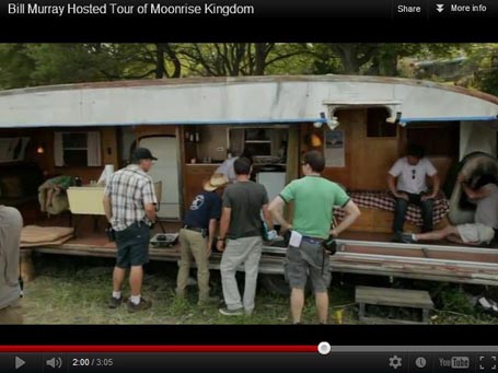 Spartanette trailer coach home to Willis' Captain Sharp in Moonrise KingdomI think I may have missed my calling. My inner set-designer is dying to work with Wes Anderson on a project. Have you seen his latest: Moonrise Kingdom? Like many of his other films – Rushmore, The Royal Tenenbaums, and The Life Aquatic with Steve Zissou -- the sets and production values/details of Moonrise Kingdom are exquisite. Anderson has a real knack for what we architects call the building section. It’s more than a knack, really; I think he has a crush on the building section.
A building section is a drawing device which slices or cuts through a space (usually vertically). Architects use the building section to communicate building component relationships. Wes Anderson uses a movie-set interpretation of the building section (adjacent rooms/spaces filmed from the vantage point of the missing fourth wall) to communicate character relationships to each other and to the spaces they inhabit. In his hands, the section implies a somewhat magical world, not unlike a dollhouse, in which the audience peeks into the adjacent inner realms of his characters. Anderson pans across and up and down the set sections he and his collaborators create, setting the movie in literal motion while unabashedly revealing that this is a not the real world, it’s something alternative, dreamy, and enhanced. He’s quoted on NPR’s Fresh Air program as describing the fictional setting of Moonrise Kingdom as “a memory of a fantasy”. Or a fantasy of a memory. This could be said, perhaps, of most of his films.
Moonrise Kingdom is the story of an innocent first summer love, set in 1965 on New Penzance, a fictional island off the east coast. New Panzance reminded me of Bustins Island on Maine, a summer escape which is of a similar size and appearance, and also has only a single emergency vehicle (or two) circling its dirt roads. However, much of the movie was shot in Newport, RI, while the interior sets were created in a nearby empty Linens ‘n’ Things. Anyway, the lead characters Sam and Suzy are misfit twelve-year olds who realize they fit each other. They decide to runaway together, which causes various semi-dysfunctional adults (played by Bruce Willis, Edward Norton, Bill Murray, Frances McDormand, and Tilda Swinton) to search for them on the island. It’s a quirky, highly stylized delight.
It opens, as I recall or at least as I choose to recall, panning across the section of Suzy Bishop’s summer home on the Summer’s End portion of the island. I read that Anderson and production designer Adam Stockhausen’s concept for the Bishop family home was inspired by Clingstone in Jamestown, RI and a converted lighthouse from the 1800s. The Island look was also influenced by Ten Chimneys in Wisconsin and a house in the Thousand Islands area at the Canadian/US border.
The 1948ish Spartanette trailer coach home for bachelor Captain Sharp, the Bruce Willis character, was particularly inspired. It, too, was filmed with its fourth wall removed. I have a thing for the warm finishes and cozy interiors in such industrial-seeming vehicles. Spartanettes were the down-market line of trailers made by the Spartan Aircraft Company in Tulsa, OK. As KHS Facebookers and House Enthusiast’s may recall, I’m a fan of domesticated vehicles like the “short bus” that architect Will Winkelman redesigned and the tear-drop campers in the movie Kitchen Stories. Someday, I aim to own and outfit my own retro coach trailer/bus, but that’s another story.
To experience a sublime, alternative, nostalgic, fantastic, island community, look no further than Anderson’s Moonrise Kingdom, where building sections reign.
by Katie Hutchison for House Enthusiast
Not-so-big houses by Katie Hutchison Studio
 Manchester Garage/Garden RoomA prospective client who's a fan of the The Not So Big House book series by Sarah Susanka recently emailed me and asked if I could fill him in on my experience designing and building with not-so-big design concepts. I thought I'd share with you a lightly edited version of my response to him.
I wrote:
I have long endorsed the not-so-big design philosophy which prioritizes quality and livability over quantity. Here are some links to a few of my projects which I believe exemplify not-so-big design.
The first is the Manchester Garage/Garden Room which is a small out-building I designed to accommodate outdoor living three-seasons of the year and a car in the winter. Multi-purpose design is a fundamental principle of the not-so-big canon. Design that maximizes versatility, comfort and fun is not-so big.
The Reading Kitchen & Bath Renovation/Addition reconceives how space is used, to better apportion it and appropriately augment it. Re-imagining flow and use to enhance livability is essential to not-so-big design. This project involved relocating the kitchen to a new addition and changing entry points and room function to support the new kitchen location, such that the owners could better access and enjoy natural light and their wooded, rear yard.
The Salem Antique: Kitchen Renovation maximizes a small space's potential while maintaining a spacious, coherent feel. Incorporating boat-like efficiency to make the most out of limited space is a hallmark of not-so-big design.
Not-so-big doesn't necessarily mean small; it means smaller. The West Tisbury House is designed to reduce its scale, such that it reads as an assemblage of elements, as if it evolved over time. Incorporating wrapping single-story features helps to ground it and minimize its visual impact on the site. From the interior, the collection of gathered spaces offer spatial differentiation, with some spaces feeling more open and others more nestled. Thoughtful massing and spatial differentiation can reduce apparent scale, while encouraging livability.
I could probably continue to reference the not-so-big design ideas behind most of the projects in my portfolio, but I'll stop there for now.
by Katie Hutchison for House Enthusiast.
The simple saltbox
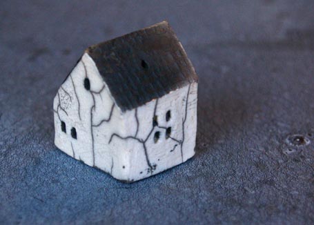 For Christmas I received this delightful, little, ceramic house ornament from a friend. You can’t tell from the photo above, but it’s only 1 1/8” wide x 1 ¼” deep x 1 ½” tall. It has a matte-black, textured roof; shiny-white, glazed walls, accented by grey crackles resulting from raku firing; and recessed rectangular windows – some grey, some white. It’s easy to rotate and work in the palm of your hand in the manner of worry beads. It’s a charming charm.
It also satisfies my Recipe for Architectural Charm. Well, mostly. Since it isn’t sited, it cannot exhibit an engaged relationship with landscape. It, however, possesses all of the other required ingredients: grounding rooflines, legible massing, simple color palette and harmonious materiality, and thoughtful details.
It’s a saltbox, pure and simple -- a form to which I and so many others intuitively respond. I wonder what parts of our brains or chemistry are triggered by the saltbox form? What else similarly triggers them? Maybe if we knew, we could more readily create other forms or spaces that likewise appeal.
I’ve written about the influence of architecture/environment/space on us, our bodies and minds, before here and here. If you’re interested in acquiring the little, ceramic house for yourself or a friend, find it on etsy. If you have a hankering to see a saltbox-inspired addition I designed, check-out the Reading, Mass. Kitchen & Bath Renovation/Addition.
by Katie Hutchison for House Enthusiast