Entries in cottage (17)
Design snapshot: Fishing shack duo
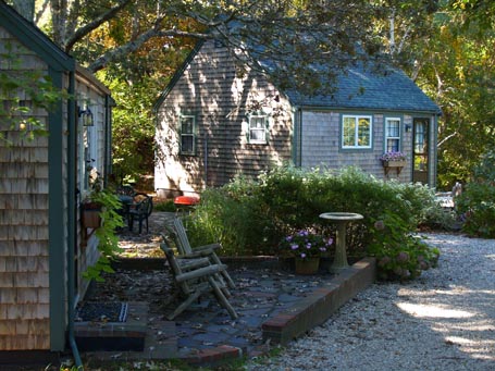
 Here are two quintessential New England charmers. These simple forms, cloaked in rugged shingles and outlined with quiet green trim, have enormous back-to-basics appeal. They work together as sibling structures or perhaps as an old, married couple: living side by side, each distinct, but compatible, with a comfortable space between them in which they welcome others to gather in their overlap. They look like they’ve led happy lives.
by Katie Hutchison for the House Enthusiast
Design snapshot: Cottage placemaking
 The siting of these simple, little cottages makes them all the more enchanting. Angled obliquely towards one another and within comfortable proximity, they are engaged with each other and the landscape, while also afforded a measure of autonomy. Informal shrubbery provides a touch of privacy for the brick-edged, flagstone patio off the front of the cottage in the foreground. A few steps back or beyond reveals a larger intermediary patio between the cottages where the occupants of each might convene for a barbeque. A weaving, gravel drive connects the cottages and accommodates neighbors passing by. Such thoughtful siting can encourage interaction while acknowledging personal space.
by Katie Hutchison for the House Enthusiast
Design snapshot: Cape crusade
 I saw this little house along the coast of Cape Cod and was instantly smitten. It’s a true Cape -- no dormers, no additions, just a simple charmer. Its prominent cedar roof and asymmetrically-placed, modest, double-hung windows lend it a hardy, no-nonsense character. A three-row band of staggered shingle coursing within a field of standard shingle coursing subtly declares this Cape’s individuality. The colorful, informal, front garden and casual, shell-lined, entry path are suitably uncomplicated. This is the essence of authentic New England at its best. This, to me, is the good life.
by Katie Hutchison for the House Enthusiast
Design snapshot: Engaging enclosed porch
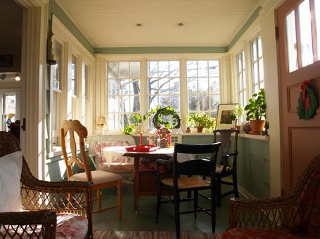
 An enclosed porch invites low winter light deep within it to brighten spirits and enliven neighboring spaces. It provides an intimate get-away that’s still visually connected with the larger, adjacent, living spaces. It improves those by offering a buffer to the street, and an additional destination.
This used to be an open-air, front porch with a wrap-around, shingled half-wall, topped by stout columns. Since it’s close to the street, it was loud and infrequently used. Now that it’s enclosed, it’s one of the most popular rooms in the house. To the left you can see the living room doorway, which was once the front-door opening. The original double-hung windows, next to it, remain and welcome borrowed light (from the newer porch casements) into the living room.
This is my parents' enclosed porch, painted my mother's favorite pale green-blue, coupled with flattering cream-colored trim. She had extra deep window sills built to accommodate her many plant treasures. She has a knack for creating cozy spaces, outfitting this one with wicker furniture and assorted chairs around an antique, flip-top table. My parents' enclosed porch is one of my favorite spots to visit over breakfast or tea. You might be surprised how enclosing your porch could improve your living space.
by Katie Hutchison for the House Enthusiast
Design snapshot: From fishing shacks to home
 We were fortunate enough to live in this charmer for a while. It’s a collection of fishing shacks that were assembled over time into a single home. The resulting house is comprised of small wings that reach out to grab daylight, view, and breeze. The wings also provide private, pocket spaces off of the larger, more public space where they intersect. Because the different appendages were once separate buildings, their upper floor levels don’t align, resulting in intermediate levels that further differentiate special spaces.
Though this house evolved gradually, it’s a great model for how to conceive of a new home. Divide spaces among smaller components, perhaps even with different floor heights, to create desirable offshoots from a primary shared living space. Resist the all-too-common tendency to bundle everything into something monolithic. A casual assemblage, like the grouped fishing shacks, can be so much more gratifying.
by Katie Hutchison for the House Enthusiast


