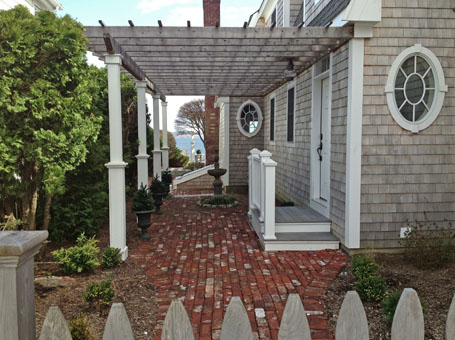
Design snapshot: Framed view
 I've written before here and here about the power of the framed view. One of those earlier examples highlighted how a framed view parses an expanse into something more manageable, more easily appreciated. The other commented on a framed view's power to tempt and deny our curiosity.
In this example, the frame of the building sidewall, pergola with its marching posts, intermediate planters, and bordering hedge create an anticipated procession which promises the ultimate reward of a desirable view (should we be lucky enough to be invited to proceed.) No matter that the bulkhead would literally block the procession, the visual axis shoots right past it. The fountain, it seems to me, should be sited further beyond the bulkhead (perhaps in place of the small distant topiary) where sky and water would abut it rather than brick and shingle.
Interestingly, the entry landing steps and guard rail suggest a parallel line of travel to the framed view. Here, in fact, you could argue that the framed view out ranks the entry. Or perhaps it's augmenting it.
by Katie Hutchison for House Enthusiast


