Entries in fence (2)
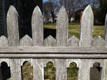
Design snapshot: Weathered fence geometry
 Good fences make good neighbors and good "Design snapshot" subjects. This one is a great example of the power of negative space. But since I've never been a big fan of the term "negative space" (due to its negative connotations), let's think of this fence more in terms of figure and ground.
Here, the fence rail and posts act as the "figure" and the space shaped in between and around them act as the "ground". In this design, both figure and ground are engaged distinct shapes which create a lively border. The rough silver-grey cedar finish contrasts the crisp geometry of the figure and ground, which makes this fence all the more "Design snapshot" worthy. Sure, if it were painted, it would still be striking, but weathered grey, it's stunning.
by Katie Hutchison for House Enthusiast
Design snapshot: Fence/wall/planter
 So which is it? A fence, a wall, or a planter? Fences are generally light-weight, thin, somewhat ephemeral demarcations between property or grounds. Walls tend to be thicker, more solid, and often seemingly permanent dividers. Planters are typically low, decorative, planted containers.
This creative composition successfully blends and morphs the common attributes of all three constructs. Like a fence, it’s built of light-weight wood, and it bounds a property. Like a wall, it has thick mass, demonstrated by its capacity to store lengths of firewood. Like a planter, it brims with decorative plantings.
Using clapboards, a customary exterior wall cladding, as fencing helps this feature blur its function. So, too, does the height of the planter, which is almost roof-like. An opaque door, adjacent to the firewood and beneath the planter, further suggests that the feature is a wall, since the door most likely conceals space constructed to store tools, yard equipment, and/or furnishings. Beyond it and the planter, I suspect the assemblage narrows to a more fence-like thickness, though we can't be sure since its face remains in the plane of the door. Had that portion stepped back to the rear plane of the firewood compartment, it would have disrupted the contiguous fence/wall appearance.
When I’m scouting for “design snapshots”, this type of hybrid, multi-function creation, which also happens to be aesthetically delightful, is one of my favorite kinds of finds.
by Katie Hutchison for House Enthusiast


