Ask Katie: Dormer and exterior-detail conundrums
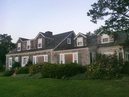
Q: We have purchased a Cape house on Long Island with the front elevation as seen in the attached picture. A poorly detailed "Nantucket-style" dormer was added at some point. Also, there was a later addition (to the right in the picture) with two gable dormers.
We are about to renovate this house, and while we would love to avoid *any* dormers, they are just too essential to the interior space.
Any ideas? Feel free to comment on any aspect of the house!
John and Cary, Springs, NY
 photo provided by homeowner
A: I’m breaking my own “Ask Katie” rule here by including a photo with a reader question, but because it illustrates a number of design issues many homeowners encounter, I believe it’s worth sharing.
dormers
As I’ve mentioned before in House Enthusiast and in columns I’ve written for Fine Homebuilding and the Journal of Light Construction, dormers can be a great way to gain second-floor living space without adding to the building footprint. The challenge is to keep them from overwhelming the roofscape or throwing the massing off balance.
Unfortunately, the dormer shown on the original Cape is too flat-faced and prominent. My first thought was of cat ears. Had it been a true Nantucket-style dormer the center shed-roofed portion would have been recessed from the two dog-house (excuse the pet theme) dormers. Overall, it’s also too tall and showing too much shingle wall relative to the windows. It is, however, nested fairly well, meaning it’s set back from the main roof lower eave, set below the main roof ridge, and leaves a generous amount of the original roof on either side.
I imagine that whoever created the addition to the right, was influenced by the cat-ear dormer when they added the two independent dog-house dormers there. Or it could have been the other way around; the dormers to the right could have inspired the dormer on the original Cape. In either case, the two dog-house dormers on the right strike me as more successful. For one, their windows are shorter, which in turn resulted in shorter dormers which are less obtrusive. I also appreciate that the dog-house dormers over the addition do not include the shed dormer component in between them, so they aren’t trying to duplicate the other dormer, but merely respond to it. These I would keep.
The solution to the dormer over the original Cape may be to replace the cat-ear dormer with a lower, shed dormer which features shorter, ganged windows in a dormer which is not as wide overall. Or a better-detailed, Nantucket-style dormer could be built in its place with dog-house dormer ends which more closely resemble the proportions of those above the addition on the right, and feature a recessed, shed-roofed wall of three ganged or individually trimmed awning windows in between. The windows within the shed-roofed component might pick up on the style and detailing of the existing cute window in the gable end of the original Cape.
additions
Then there’s the matter of how the addition to the right meets the original house. Ideally, this would have been set back slightly, by at least a foot or so, to keep the lines of the original Cape in tact and the addition subordinate. Removing the portion which is flush with the front wall would ameliorate the situation, but somehow I doubt you’ll want to sacrifice the living space, unless you can make up for it by adding elsewhere.
The repetition of the picture window assembly is a bit regrettable too. I can’t tell from the photo if it’s repeated again behind the shrubbery to the far right. One improvement may be to construct a bay in the addition, in lieu of the second picture window assembly, perhaps by extending a portion of the shed roof and centering it on the dog-house dormer above. This would add a little depth to that elevation and break up the redundancy of the picture window units.
The entry to the house would also benefit from a little shelter. A small, bracketed, shed-roof extension there might help highlight the entry while providing cover for arriving guests.
shutters
Lastly, as frequent House Enthusiast readers may recall, I’m a purist about shutters. I believe they should be sized such that if closed, they would actually shutter the entire window. So, I’d remove them from the picture window units. Since these shutters are nicely detailed with what looks to be sailboat cut-outs, I’d keep them on the first floor, single-unit, double-hung windows, assuming they’re right-sized.
by Katie Hutchison for House Enthusiast
Email architect Katie Hutchison (Katie@katiehutchison.com) your general-interest residential design question. Put "Ask Katie" in the subject line and summarize your question in a couple of paragraphs. Include your name, town, and state. Don't include any attachments. Check back with the Ask Katie category to look for Katie's responses to select questions.


