Primer: Third dimension
 Learn to modulate this potent design factor
You would think it would be obvious, but sometimes it needs to be said: attention to the third dimension is critical to shaping space. All too often in a rush to plan room-to-room adjacencies and sequencing on a particular floor level, treatment of the third dimension becomes an afterthought. The common default of endless flat ceilings is a missed opportunity. So is circulation between full-height walls in lieu of passage through capped doorways. Even worse, the third dimension is frequently manipulated in a misguided attempt to meet so called “market demand”. Real estate listings boast double-height entries and “great rooms” as assets when often such spaces are poorly designed and prove overwhelming and discomforting. They needn’t be. Spatial variety in the form of interludes with lower ceilings in which to pause or take personal shelter can relieve otherwise tall, open spaces.
The tendency to think in two dimensions, rather than three, means many are only addressing two-thirds of our spatial experience. We can do better. In this primer we’re going to look at everyday outdoor examples in which the third dimension is tempered to create different effects which support different activities, expectations, and moods. I’ll translate those examples to simple diagrams to apply to our indoor environments. With a little thought and common sense, we can begin to harness the rewards of varying the third dimension in our homes.
portal
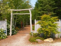
Mytoi gateThe entrance gate at the Mytoi garden on Chappaquiddick announces a significant threshold with humble materials in a straightforward arrangement. The bare, tree-trunk posts on either side correspond to the width of the path and channel direction. The bare tree limbs across the top are almost transom-like; they interrupt the open air above to complete an accented portal whose overall height is in proportion to its width. The scale of this gate welcomes the collective. It signifies the beginning of a narrative, frames an experience, and builds
section through door opening between interior spaces anticipation about what is to follow. Had the top limbs been omitted, it would have compromised the significance of the passageway, focusing instead on way-finding. An interior portal in a wall between two spaces can strive for an effect similar to the Mytoi gate. The scale of a doorway, whether it includes a transom, and how it’s shaped as well as finished can influence the experience of the threshold. Its height matters.
sheltered alcoves off space with cathedral ceiling
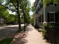
boulevardMany of us have enjoyed a wide boulevard edged with a softening tree canopy. Whether driving down the open middle or walking along the edge under the shelter of arching tree branches, we have appreciated the spatial hierarchy. An interior translation of the boulevard concept can be found in a space with a cathedral ceiling and flanking alcoves that open off it. The change in ceiling height between the perimeter spaces and the central one, allows for different activities to take place in a shared open
section through boulevard volume without one activity precluding another. Large groups can gather in the center to engage in the bustle of lively company while small groups or individuals can populate the edges for quieter activities without being completely removed from the central action. If you imagine the boulevard with the
section through cathedral ceiling with side alcoves tree buffer and sidewalks removed, suddenly it’s a lot less appealing. Without any differentiation in height, it becomes more of a thoroughfare, without comfortable pedestrian-scaled activity along the edge. The same goes for a space with a cathedral ceiling without the bordering alcoves. It’s all bustle with no place to slowdown and take a breather.
visible or patterned structure overhead
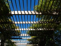 A pergola is a delightful way to mediate between open air and shelter. The framework overhead can support climbing vines to create shade and protection over time, or it can be left bare to define a partial enclosure that creates shadow patterns while implying
section through a coffered ceiling a boundary within a larger environment. Either treatment defines a richly nuanced place. A densely planted pergola could inspire a coffered ceiling in the interior realm. The crossing beams forming the coffers
section with rafter ties overhead would mitigate the height of the overall ceiling while creating a textured shelter much like the mid-summer, vine-covered pergola. A bare pergola could inform an interior cathedral ceiling that features visible collar- or rafter-ties that suggest an intermediate slatted ceiling plane of a more relatable scale within the taller cathedral space, the way an open pergola does.
encompass and release
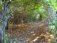 Traveling a wooded trail through dense encircling growth with a glimpse of a light-filled clearing in the distance can create an appealing sense of expectation. The comfort of the
section through barrel vault sheltering tree canopy could be compared to an interior barrel vault or tray ceiling. These can function alone to create a sense of embraced shelter, or be coupled with a hint of a greater volume beyond to build anticipation. The sequence of wooded compression
section through tray ceiling and open air release could be translated into an entry procession through a space with a relatively low ceiling that opens into a more expansive space with a taller ceiling. The procession gives an arriving homeowner or visitor time to look forward and adjust to the transition from one ceiling condition to the other.
vertical circulation

Block Island stairNaturally, it’s difficult to ignore the third dimension in a stairway. It requires vertical clearance in order to function. These two outdoor stairways invite you to enjoy verticality from above and below. Cascading down through space as in the Block Island stair, you experience an ever changing aerial view en route to your destination. Much like an interior or exterior balcony overlooking a spectacular space or view, this stair
wooded stair celebrates verticality and the opportunities to survey it affords. The wooded stair seen from below accommodates vertical circulation under the canopy of a tree. Since the space isn’t open to the sky, it offers a
section through room with a stair tempered verticality, in which clearance diminishes as you ascend, much as it would on a typical interior stair. Nonetheless, the light beyond invites curiosity about what will be discovered at the top. Both stairs take advantage of our capacity to wonder.
eyes open
When imagining how you might treat the third dimension in the design of your own home, reflect on the simple examples mentioned above and seek out other inspirations in the world around you. Maybe pedestrian overpasses between rows of townhouses will catch your attention, or the exposed overhead structure of a park gazebo will get you thinking. Look up as you look around, to better understand what’s shaping your experience.
by Katie Hutchison for the House Enthusiast


